Tutorial: Create simple graphics with Box Chart Maker
February 19, 2013
As part of my AP-Google journalism in technology scholarship, I developed a tool to help journalists create simple graphics for online. I call it Box Chart Maker. I’ll walk through the creation of a chart using the tool.
The first step to creating compelling graphics is to find interesting data. Box Chart Maker creates a very versatile type of chart that can represent almost any story involving numbers (so, yes, that’s almost every story ever, in some way). I’ll use last week’s vote to proceed on the confirmation of Chuck Hagel as Defense Secretary.
The interface of Box Chart Maker
Now that we have some data, go to the Box Chart Maker site. Here, you’ll find an example graphic already created. That was easy! If you’re representing “Data title” and have 36 items, you’re done. Otherwise, we’ll want to customize these options.
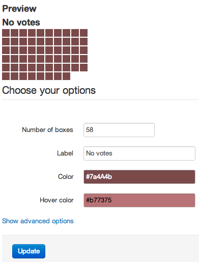
Let’s start with the “Yes” votes. The motion won 58 yeas, so let’s represent that in our first chart. Fill out the form with the correct information (58 boxes, “Yes votes” as the label, colors as you see fit). Under advanced options, change the ID to “yes_votes” or similar. This will allow multiple charts on the same page. When the options look good, hit the update button, and you’ll see your chart appear in the preview area.
If you’re happy with the chart, click on “Show embed code” under the preview button. A text box will appear containing all the html/css code that represents your chart. Copy that, and throw it in a fresh text document.
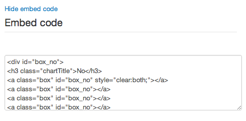
Embed code
Now, do the same for the “No” votes. When you’re happy, copy the code and put it under the “Yes” votes code. Save the file as an html file, and open it up in your browser. Here’s what mine looks like:
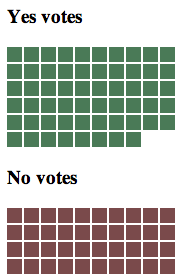
Raw output of Box Chart Maker
You’re done! Of course, you’d want to add context to the chart, such as that the motion required 60 votes to succeed. But for absolutely no hand-coding, that’s not a bad graphic. Paste the code directly into your blog or CMS, and you’ll have a nice web-friendly graphic to help explain your story. Not bad for a few minutes of work.
Pro tip: If you’ve got more time and some html/css know-how, it’s simple to enhance the output of Box Chart Maker. Here’s what I came up with after a few more minutes of tweaking:
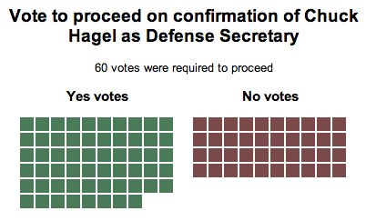
Edited output of Box Chart Maker
Publish!